01
the cover
02

the contents
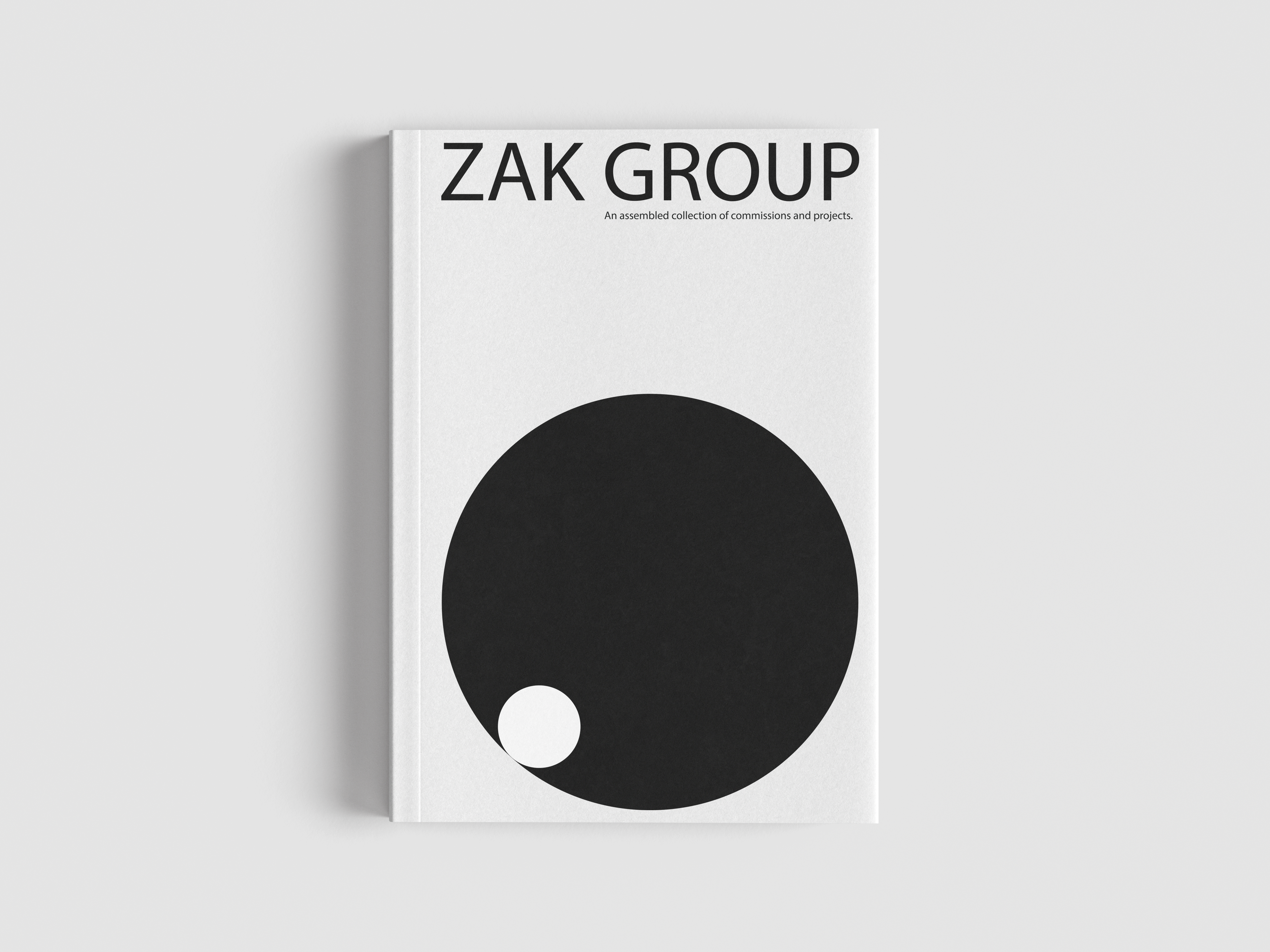
I decided to design a simple book cover that brings together all of Zak Group's projects. It's essentially a brand catalogue that collects their work in one place.
Looking through Zak Group's projects, I noticed that they keep a consistently minimalist style across their website: clean, basic typefaces, a crisp and uncluttered layout, and very little decoration. I wanted the cover to reflect that same restraint, so I built it from only a few essential shapes and one clear, easy-to-read typeface. The focus is on letting the work speak for itself rather than dressing it up.
The central motif is a circle set inside a larger circle. It's a deliberately simple mark, but it carries the idea that no matter how large Zak Group has grown, the studio itself was always one part of a bigger design process: the smaller circle held within, and shaped by, the whole.